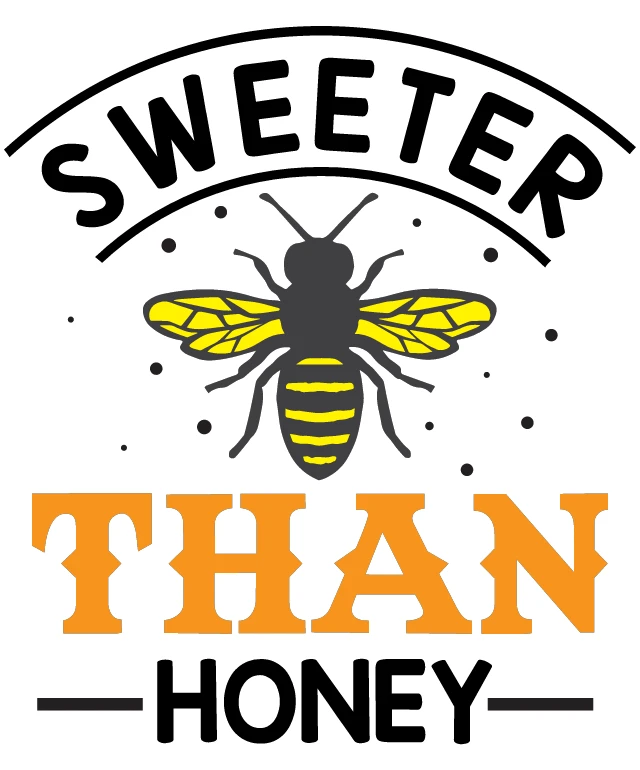
This design features a logo with a playful and inviting design. At the top of the logo, the word "SWEETER" is written in a bold, black font. Below this, there's a stylized depiction of a bee, rendered in a combination of black and yellow, which are the traditional colors associated with bees. The bee is positioned in the center of the logo, drawing attention to it. Beneath the bee, the phrase "THAN HONEY" is written in a large, bold, orange font. The text is arranged in a way that the words "THAN" and "HONEY" are on the same line, while "HONEY" is on a separate line, creating a visual hierarchy that emphasizes the phrase "THAN HONEY." The overall style of the logo is simple and clean, with a clear emphasis on the text and the bee illustration. The use of bold colors and a simple design suggests that the logo is likely intended for a brand or product related to honey or sweetness.
Sweet Than Honey: A Logo for a Honey Brand
Design this TShirt
Design this Mug
Design this Sticker
Download for personal use
Product
Add to cartShare on Facebook
Share on X
Share on Pinterest
Other Designs