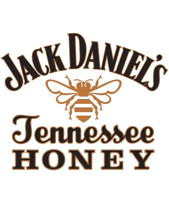
The logo for Jack Daniel's Tennessee Honey features a bold and stylish design that captures the essence of the brand. At the center of the logo is a striking image of a honey bee, rendered in a rich amber color that evokes the sweetness of honey. This bee is intricately designed, with detailed wings and a segmented body, emphasizing the natural and organic quality of the product. Surrounding the honey bee is the brand name "Jack Daniel's" in a classic, serif font, colored in a deep brown that complements the honey bee's hue. The font is bold and easily readable, conveying a sense of tradition and reliability. Just below the brand name, the words "Tennessee Honey" are displayed in a slightly smaller font, also in brown, but with a lighter shade that adds contrast and distinction. The overall layout of the logo is balanced and harmonious, with the text and imagery arranged in a way that draws the eye across the design. The use of a consistent color palette and elegant typography creates a cohesive and appealing visual identity for Jack Daniel's Tennessee Honey. This logo effectively communicates the brand's commitment to quality and authenticity, making it a strong and memorable representation of the product.
Jack Daniel's Tennessee Honey
Design this TShirt
Design this Mug
Design this Sticker
Download for personal use
Product
Add to cartShare on Facebook
Share on X
Share on Pinterest
Other Designs