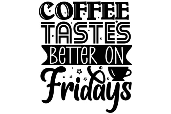
This design features a graphic design that prominently displays the phrase "COFFEE TASTES BETTER ON FRIDAYS" in a stylized font. The word "COFFEE" is written in a large, bold font, while "Tastes" and "Better" are in a smaller, sans-serif font. The word "ON" is emphasized by being larger than the other words. Below the main text, there is a smaller banner with the words "FRIDAYS" and "BETTER ON" in a similar style, but with a slight italicization. The phrase "FRIDAYS" is larger than "BETTER ON," and both words are in a sans-serif font. To the right of the banner, there is a graphic of a coffee cup with a handle and a small starburst design above it. The overall design is simple and clean, with a clear focus on the message of the text. The use of black and white gives the image a classic and timeless feel.
Coffee Tastes Better on Fridays: A Graphic Design Poster
Design this TShirt
Design this Mug
Design this Sticker
Download for personal use
Product
Add to cartShare on Facebook
Share on X
Share on Pinterest
Other Designs