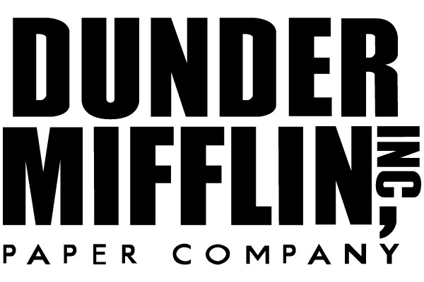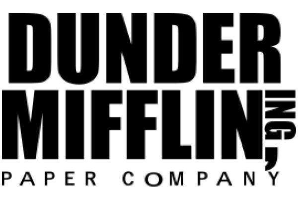
The logo presented is a clean and straightforward design, exuding a professional and bold aesthetic. The font is sans-serif, which contributes to the modern and crisp look of the logo. The text is capitalized, enhancing its impact and readability. The choice of a sans-serif font suggests a contemporary and approachable brand identity. The layout is symmetrical, with the company name "DUNDER MIFFLIN" prominently displayed in the center, followed by the words "PAPER COMPANY" in a smaller font size directly below. This arrangement emphasizes the company's primary focus on paper products. The logo's simplicity and clear typography make it easily recognizable and memorable.
Like
Dunder Mifflin Paper Company
$22.95 USD Sale price $20.00 USD
Design this TShirt
Design this Mug
Design this Sticker
Download for personal use
Product
Add to cartShare on Facebook
Share on X
Share on Pinterest
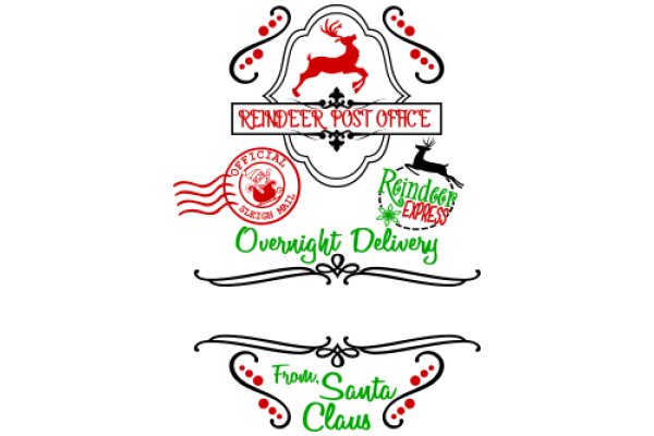
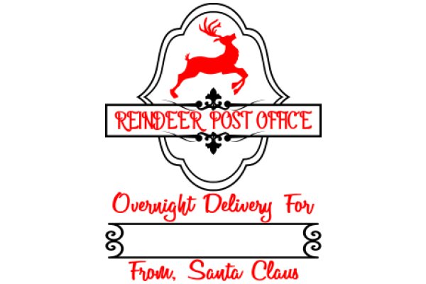
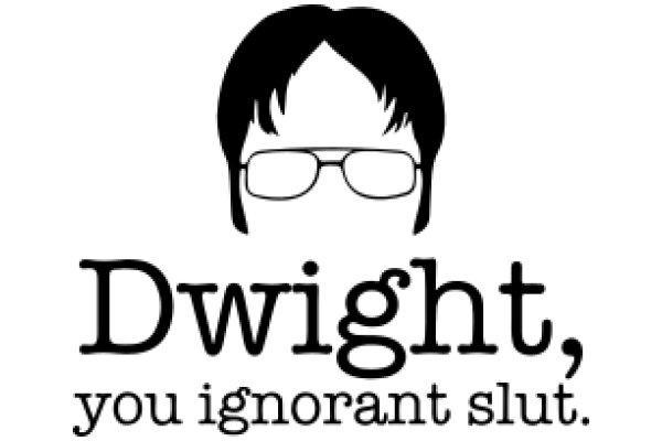
Other Designs