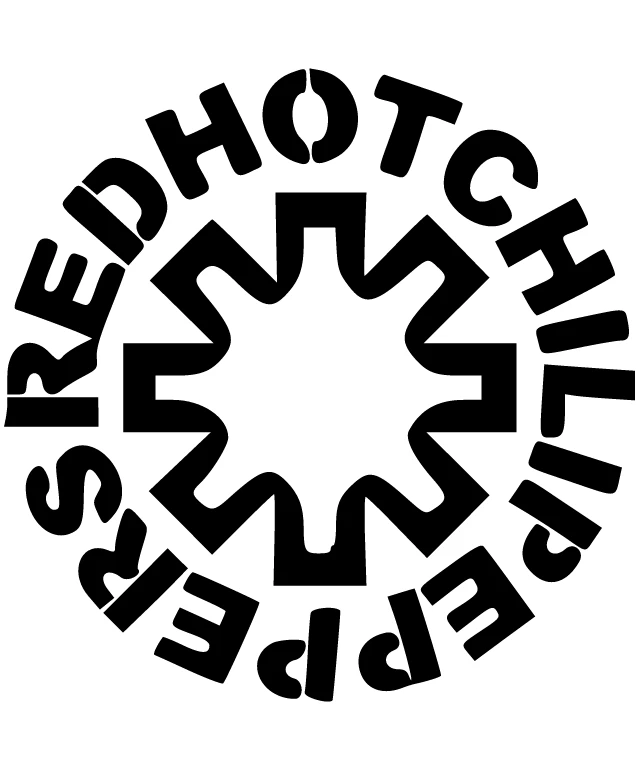
The design features a bold and striking design that captures the essence of the Red Hot Chili Peppers, an iconic rock band. The design is composed of a circular arrangement of the band's name, with each letter meticulously crafted to form a cohesive and dynamic pattern. The letters are stylized in a way that evokes a sense of rhythm and movement, reflecting the energy and passion that the band is known for. The design is executed in a high-contrast black and white color scheme, which enhances the visual impact of the typography and makes the text stand out prominently against the background. The use of negative space is particularly effective in creating a sense of depth and dimension, as the letters appear to be floating within the circular arrangement. Overall, this design is a testament to the band's unique identity and musical style, capturing the essence of their sound and attitude in a visually compelling way. The attention to detail and precision in the typography showcases the band's commitment to excellence and their dedication to their craft.
Red Hot Chili Peppers logo.
Design this TShirt
Design this Mug
Design this Sticker
Download for personal use
Product
Add to cartShare on Facebook
Share on X
Share on Pinterest
Other Designs