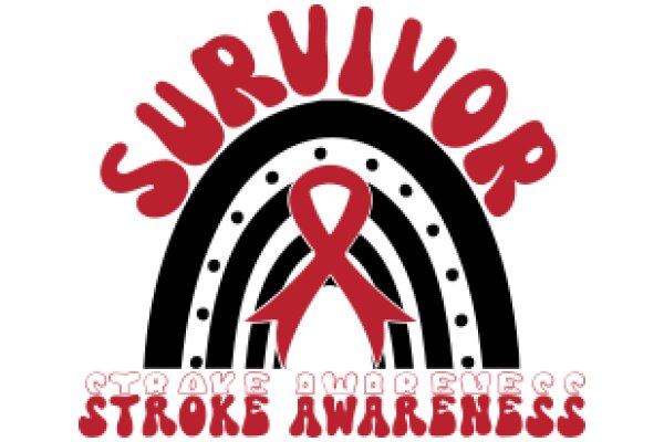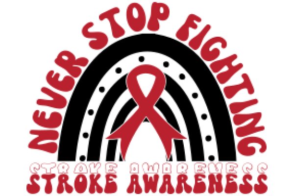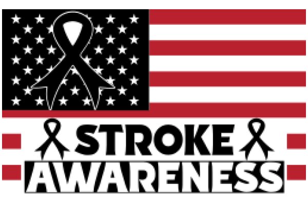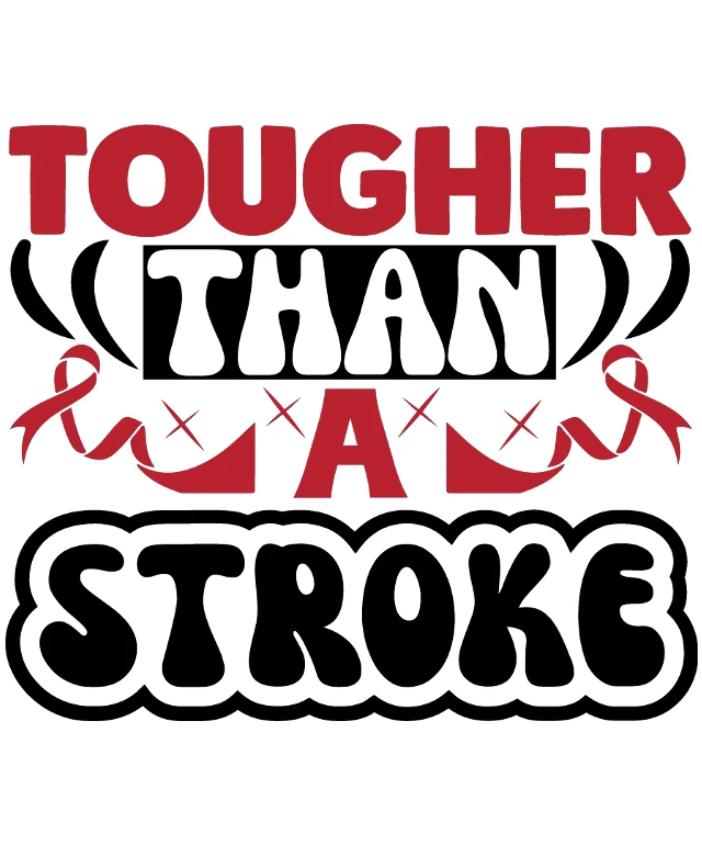
This design features a graphic design with a combination of text and symbols. The central text reads "TOUGHER THAN A STROKE," which is a phrase that is likely intended to convey a message of strength and resilience. The phrase is stylized with a bold, red font that stands out against the background. To the right of the text, there is a red ribbon with a white "X" through it, which is a common symbol for awareness of breast cancer. This ribbon is often associated with the Breast Cancer Awareness movement. Below the main text, there is a smaller phrase "A STROKE" in a black font, which is likely intended to emphasize the phrase above it. At the bottom of the image, there is a large, stylized letter "S" in a white font with a black outline, which is likely intended to represent the word "stroke." The overall style of the image is graphic and appears to be designed to convey a message of strength and resilience in the face of a stroke. The use of bold colors and stylized text gives the image a dynamic and attention-grabbing appearance.
Tougher Than A Stroke: A Graphic Design Showcasing Strength and Resilience
Design this TShirt
Design this Mug
Design this Sticker
Download for personal use
Product
Add to cartShare on Facebook
Share on X
Share on Pinterest
Other Designs