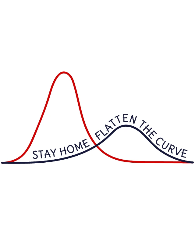
这幅图片展示了一个图形设计,旨在传达有关COVID-19大流行期间公共卫生信息的信息。设计由两个曲线组成,一个红色,一个蓝色,它们在中间相交。红色曲线代表在大流行期间感染人数的典型增长趋势,而蓝色曲线代表通过实施社会隔离等措施来减缓感染率的方式。在两根曲线的交汇处,以粗体、大写字母写着“在家隔离”,而红色曲线的上方写着“降低曲线”,表示通过采取预防措施来减少感染人数。这种视觉呈现有效地传达了公共卫生措施的重要性,旨在减缓疫情的传播,从而防止医疗系统不堪重负。设计的简洁和清晰使其易于理解,强调了保持社交距离的重要性。


CoronavirusPandemicSocial DistancingPublic HealthStay HomeFlatten The CurveCovid-19InfographicPandemic AwarenessGraphHealthcarePublic SafetyGraphsStatisticsMedicalPrevention

Other Designs

A Colorful Collage of Crisis-Related Words and Phrases from 2019, with a Focus on Global Crisis, Financial Crisis, and the PandemicA Year of Crisis: 2019's Global Pandemic, Financial Struggles, and the Coronavirus OutbreakStop Corona VirusSorry I Can't Social Distance TodayStay Home and Flatten the Curve: A Graphical Representation of Public Health AdviceLet's Stay Home: A Message of Comfort and SafetyLet's Stay Home: A Message of Encouragement and SafetyHealthcare Professional with StethoscopeTogether is Our Favorite Place to BeSafety First: A Nurse's Guide to Drinking Responsibly
Subscribe to our newsletter:
Currency: USD
Language: English
Mature Content: Safe
© 2025 ZAGD