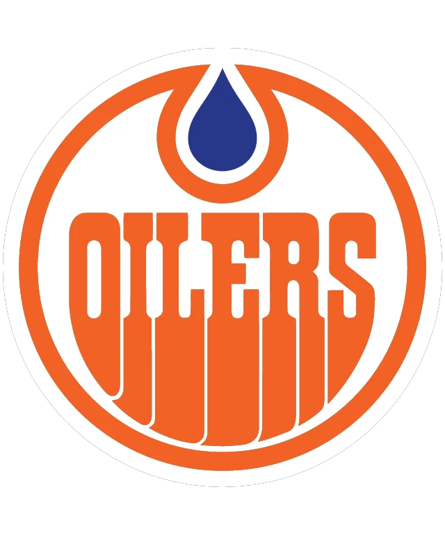
The logo of the Edmonton Oilers is a striking and distinctive emblem that captures the spirit and identity of the team. The design features a bold, orange circular border that frames the central elements, creating a sense of unity and cohesion. Within this border, the word "OILERS" is prominently displayed in bold, white capital letters, exuding a strong and confident presence. The typography is clean and modern, making it easily readable and impactful. At the top of the logo, a blue water droplet is suspended, symbolizing the team's connection to the oil industry and the city's geographical identity as the capital of Alberta. The droplet is a vivid shade of blue, which contrasts beautifully against the orange background, drawing attention to its significance. The overall design of the logo is simple yet effective, with a strong visual impact that is easily recognizable and memorable. The use of bold colors and clear typography ensures that the logo stands out and conveys the team's identity with clarity and authority. The design is a testament to the team's history and spirit, making it a proud representation of the Edmonton Oilers.
OILERS
Design this TShirt
Design this Mug
Design this Sticker
Download for personal use
Product
Add to cartShare on Facebook
Share on X
Share on Pinterest
Other Designs
